From this magazine ‘DRUMMER’ there is an appealing look as the features are linked to the images which makes it more interesting. The masthead ‘DRUMMER’ is in big capital letters and is also in the colour black which grabs the audience’s attention by indicating the theme shown on the page. The editors have used the masthead in the contents page which can be seen as unconventional. This may have been done to emphasise their point about drummers and remind the audience what the main focus point is. The typography is bold and black which highlights a serious theme. There is also a picture of a drum set besides the logo which again emphasises the point. This can be reflected by the masthead as it is also big in black font that can indicate drums are loud, lively instruments targeting teenagers who are fans of drummers. The two M’s look like the drum set in the image.
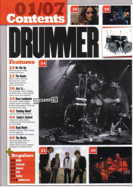
The artist shown in the main image is playing a drum which shows the genre of rock music. The main image (which is bigger than the others) signifies the genre of the magazine. The male is showing a stereotype of the specific genre shown by wearing very casual black clothes; t-shirt & trousers, and a baseball cap. He has the prop of a drum set which can show maybe he is a professional artist that specialises in rock or heavy music. The image is in black and white which gives it an olden time image. There are also many other smaller images presented out on the page. The images make the magazine look like there is interviews with these people and this may interest the audience. All the smaller pictures have something in common which are the colours red, white and black. The other artists also seem to specialise in rock and from this we can tell the magazine is attracting fans of this genre. Most images are of drummers with a drum set therefore it can specifically target teenagers who like drummers. The images have page numbers on them which are in red allowing easy access for the reader. This allows them to read articles about their preferred bands.
The images take most of the space on the page which makes it attractive to look at. The content page uses more images than text which might have been done intentionally to target a younger audience. They possibly did this to emphasise the point that younger audiences prefer visual images rather than text. This can be seen as unconventional as most magazines have content pages which are quite detailed. This may be done to help sell the magazine successfully as the music industry can get quite competitive.
The layout is very ordered and neat with the contents split into different band sections making it easier for the reader and into a ‘Regulars’ section to let the audience have a look at what is always in the magazine. The information is in one column grouped into two sections which is quite conventional for a music magazine. The page numbers are in red which are eye catching and indicate to the audience where to go to get information for certain things. This can be subverted towards the stereotypes of rock music in which this genre usually doesn’t show being “neat” or “ordered”. The use of colours of the features makes things look more organised. The red colour theme is shown throughout this page. For example the page number, the title, the boxes and the drum set at the bottom are all in the same type of red. The features titles are written in black for example ‘On the up’ which stands out drawing the audience’s attention towards it even though it’s quite a small font.
Overall, this magazine has used many typical conventions such as images, typography, the date issue, and colours to make things look more appealing. From the analysis of the contents page, the main target audience is probably young teenagers who are fans of rock music and drummers who specialise in this genre.
No comments:
Post a Comment