Saturday 29 January 2011

Graphs For Questionnaire

Presentation On graphs


Question 3- What music genre do you listen to? You can tick more than one box.

The results from the question based on Music genres has shown me that the most popular genres happened to be R&B,Hip hop,Rock/Indie and Funky house. This can be seen as important as it will help me choose what genre I intend on doing for my music magazine. As there are similar figures in the most popular genre I'm thinking of doing a Rock/Indie genre which would appeal to a wide range of audiences. 

Question 6)      What features would you like to see in a music magazine? 


From this data, I wanted to find out what people would like in a music magazine and this was successful as it gives me many ideas of what I will include. Interviews was the most popular and people find this the most interesting to look for in a music magazine, as well as fashion being the second popular. In my magazine, I will have interviews,photos, fashion and promote some events/concerts. 


Question 10- How much are you willing to spend on a music magazine? 


From the data, we can see that most people out of my sample of 20, are willing to pay between £1-2 for the magazine and I intend not to go against this, therefore to maintain an suitable profit I will set my magazine at the price of £2. 


Question 11-Do you enjoy being a part in competitions?


This question is based on competitions and whether or not target audiences would participate in them. From the figures we can see that, 11/20 said yes and 9/20 said no. I will probably use this feature in my magazine however I will not draw all my attention to this part. 


Question 12-Do you often use the internet? 


This question was asked to find out how often people use internet and from the graph we can see that all 20 respondents said yes. This has influenced me to have a website address on my front cover and contents page as a convention of a music magazine, which I'm hoping, will encourage the audience to get access to more information via the web address. 


The Music Magazine Questionnaire

Questionnaire

Friday 28 January 2011

Double Page Spread Analysis 2


This is a double page spread from a NME magazine which shows a band of 3 members; ‘The Teenagers’. The fact the article is called ‘The teenagers’ can directly appeal to young audiences. Besides the heading, it says “NME Loves” and this can not only target the specific audience group which NME specialise in (teenagers) but also encourage more people to buy the magazine. This puff will persuade the readers to read on. Also by the magazine recommending them would mean they are good as the company “loves” them.

The heading is large in blue block capitals places on a white background which grabs the audience’s attention. The colour used may attract the readers as they see things such as colours and images as important aspects in any type of magazine. This heading goes on top of the image which can indicate their importance. Underneath the heading is a slogan; “Young dumb and full of filthy tunes” which is quite catchy and can appeal to the youth encouraging them to read on. The slogan suggests many teenagers go against many norms and values in the wider society.

The double page spread consists of a large central image on the left which can be seen as conventional of other layouts in magazines. The image is of the band; ‘The Teenagers’ lying on a bed. The long shot allows us to see aspects such as mise-en-scene and colours. From the first glance of the 3 male’s the audience can assume they have something to do with a genre of Rock. From the mise-en-scene we can see there are many photos and posters on the wall which can imply teenager’s reminisced memories, by keeping them safe. The magazine here, relates to the target audience as many youngsters tend to have a bedroom which is similar to what is shown. We can probably assume this room is a male’s room as there are photos of women on the wall which many male teenagers have nowadays. The posters are places in different angels on the wall which signifies a “scruffy” look which is usually how Rock/Indie bands are like. All members of the band are dressed in a way which informs the genre of the magazine to the reader. They are dressed quite casual by wearing blue skinny jeans, t-shirts, leather jackets, and trainers which relates to many members of the target audience. This also connotes how people from rock bands, stereotypically dress. The male in the middle is wearing, as many teenagers would call “nerd glasses” and this tells us they are going for the “cool” look by looking casual yet sophisticated.

We can see all three of them are lying on a bed looking very relaxed which can stereotypically relate to the target audience of teenagers as they are seen as “lazy”. All three members are directly looking at the camera which is an example of direct address via a conformational stare which reinforces that the magazine are getting people to buy the magazine by involving the audience. This image overall can be seen as conventional image coming from an NME magazine as they are specifically used teenagers in the image allowing more young people to relate to this aswell as the heading.

Furthermore, ere are also other images used on the double page which can again be seen as typical features. The images are of other rock bands which make the page look encouraging as it promotes the band “The Teenagers”.

The article is in columns (a conventional way of writing text on a double page) however looks like it has been squashed between the image on the left and the text on the right which would draw the reader’s eye towards it. The writing is in white which stands out. The columns allow the text to look very structured and organised. A floating quote is also used which is not very noticeable. At the beginning of the article, the letter ‘T’ is in black, bold, large font which shows this is structured like a newspaper and draws attention towards this section.

Many colours are used such as white, blue and black. These colours can target male youngsters as they are quite dark, dull colours and this can be seen as stereotypical colours of what males like. The colour blue signifies a new start of youths which is the target audience of most ‘NME’ magazines. The background highlighted by the colour black can portray the view of teenage boys as dangerous or rebellious.

The ‘note’ at the bottom left, holds information about the band which informs the audience what they are reading about. On the right side of the double page, is a column of what ‘Everyone’s Talking about’ followed by 3 bands; Asobi Sesksu, Crystal Castles, and The Rascals which can be seen as a focus point of the magazine to the audience as it is separate from the main article of ‘The Teenagers’.
Overall, this double page spread can be seen as conventional of a ‘NME’ rock magazine in which the audience can relate to. The use of three main colours can specifically target teenagers.

Thursday 27 January 2011

Double Page Spread Analysis 1


This is an article from music magazine: ‘NME’ where Lilly Allen is the main focus of being interviewed. The only image on the page is quite large, taking up most of the space and this can show the importance of her being an artist or the most important aspect on the page. This image allows the audience to focus on here and not get distracted by anything else. It can be said that Lilly Allen is represented in a stereotypical way of a rock artist. However, the layout can be seen as unconventional towards the genre of the magazine. She is represented with her hands on her back. Plain checked rolled up sleeved shirt, dark black short hair and very heavy makeup. This can be a stereotypical look of many rock stars, thus this may have been doing intentionally. The fact that her hands are behind her back indicates her posture is showing she is not bothered and this shows a rebellious side of the artist.

We can also tell this magazine is specialised in a rock genre from the way she is dressed. She is going for a very scraggy look with her shirt and heavy black makeup and hair which represents her rock culture. She is not dressed as we would expect her to as a girl. For example, she isn’t wearing a dress, making the image attractive to look at. She is going against the stereotypical norms of a female.

The title “people think I’m an attention seeker, but I’m just honest” is a floating quote. This can be seen as a conventional feature of most double pages. This quote interests the audient to read mot about this article if Lilly Allen is not a stereotypical rock artist due to the quote, therefore the audience might want to know more about her. The quote gives very little information about herself in which the audience would again be more interested and hence wanting to know more. The image being place next to the quote emphasises the point of the quote even more. She can be seen as very upfront in admitting what she feels and this can be conveyed by her being the only image on the page.

This quote takes up alot of space and this can be seen as unconventional because usually this aspect is not seen as the most important in the magazines. The text of this quote is quite messy which shows the stereotypes of rock music. It is shown in a newspaper layout, in which the article is in columns which is a conventional way however the text is short which we assume may carry onto the next page. The font is very bold with white writing, where each letter looks like it has been cut out of a magazine and placed on a black background. This adds towards Lilly Allen being portrayed as a mysterious character.

There are many other conventions of this double page spread. The language is directly targeted at the audience and we can see this via the floating quote which is quite informal. The language used is usually linked to the genre of most magazines and this withdraws the audience’s attention even more.

Overall, this double page spread of the NME magazine can be seen as partially conventional. There is no heading, more images or colours. The main colours used are red, black and white which can signify the theme of rock however many magazines have more than one picture to interest the audience, but this magazine has failed to do so. The target audience can be said to be teenagers, who are interested in rock/Indie music.

Wednesday 26 January 2011

Contents Page Analysis 2


This content page instantly has the logo of the magazine 'Q' which reminds the audience what magazine they are reading.It shows the Rock band 'The Courtnees as the main audience focus point. Throughout the page, the text is mainly in black and white which is formally written in an organised manner, keeping things formal and this allows the audience to read the text straightforwardly. The use of these colours can indicate the theme of purity or seriousness. This can also convey the target audience for this magazine which is male and females of the young adults/ older generation rather than teenagers. If this magazine was aimed at teenagers, a wide range of optimistic colours would have been used such as yellow and blue, and this may be difficult for the audience to see what the magazine is offering whereas these formal colours are simple to understand. The black and white texts are based on different colour backgrounds such as red and white, which makes the writing stand out. Sell lines listed under the titles such as; ‘Bobby Gillespie looks back on his rock’n’roll CV’ in which the audience assume this is some part of an article therefore might want to buy the magazine and read on to find out more.
Furthermore, an image is shown which engages the audience via direct address. This is a big image which is probably the first thing that grabs attention on this page. From the mise en scene shown from an establishing shot, we can see the way they are dressed. We can assume they are a band (The courteerns) and maybe specialise in Indie/Rock type of music. They all have long brown hair which can be seen as stereotypical of many Indie artists. They are dressed quite casually which can target "cool" "hippy" people. They are wearing jeans and a t-shirt which is how rock bands usually dress and this allows the audience to relate to them by the casualness of clothing. This rock band; the courteerns are upcoming which can encourage the audience to buy the magazine. On the other hand, this can be contrasted with the other picture on the bottom of the page which is much smaller however grabs attention towards the image. This is highlighted by the man; Nick Cave, wearing a purple suit which stands out on the page, in comparison to the image above which has depressing colours such as black and white. On the image, we are given the page reference without any information which can encourage the reader to read on.

Many features are organised well in a column which provides information for the audience. 'Oasis Special' is written in a different colour (gold) which makes it stand out as it is the issue's unique selling point. This can show this group are seen as only one of its kind and we see this by the segregation of colours. This can attract the audience as it is separate from the main topic on the cover. It can also suggest that the features of the Courteerns and Oasis are quite like each other as they are both on the same magazine which can attract different type of audiences. Similarly, ‘The world’s biggest and best music guide’ can show this is another selling point of the magazine.

A typical convention is adhered to such as a website address on the top right corner which reminds people to visit the website. The use of a website address can be seen as an example of synergy, which advertises their magazine across different Medias. There is also a MySpace website at the top of the page which can show ‘Q’ not only uses synergy but also is an example of a convergence industry in which they allow their audience to view magazines online and listen to music via the net which can show a new way of audience’s consumption. The white bold font of 'Every Month' at the bottom left, tells the target audience, the magazine releases an issue monthly for regular ‘Q’magazine buyers and we can see this from the date 'October 2008' which reinforces how recent the issue is. Overall, Qs content page is seen as individual as they usually promote a band without much information which can encourage the audience to read on and find out more whereas other magazines such like XXL who sometimes specialise in fashion aswell as music.

Tuesday 25 January 2011

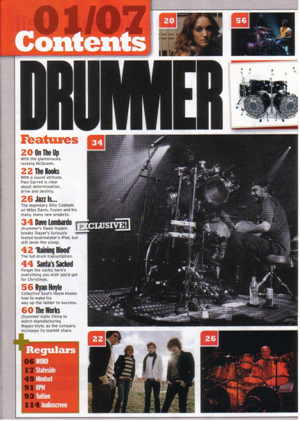
Content's Page Analysis 1


From this magazine ‘DRUMMER’ there is an appealing look as the features are linked to the images which makes it more interesting. The masthead ‘DRUMMER’ is in big capital letters and is also in the colour black which grabs the audience’s attention by indicating the theme shown on the page. The editors have used the masthead in the contents page which can be seen as unconventional. This may have been done to emphasise their point about drummers and remind the audience what the main focus point is. The typography is bold and black which highlights a serious theme. There is also a picture of a drum set besides the logo which again emphasises the point. This can be reflected by the masthead as it is also big in black font that can indicate drums are loud, lively instruments targeting teenagers who are fans of drummers. The two M’s look like the drum set in the image.

The artist shown in the main image is playing a drum which shows the genre of rock music. The main image (which is bigger than the others) signifies the genre of the magazine. The male is showing a stereotype of the specific genre shown by wearing very casual black clothes; t-shirt & trousers, and a baseball cap.  He has the prop of a drum set which can show maybe he is a professional artist that specialises in rock or heavy music. The image is in black and white which gives it an olden time image. There are also many other smaller images presented out on the page. The images make the magazine look like there is interviews with these people and this may interest the audience. All the smaller pictures have something in common which are the colours red, white and black. The other artists also seem to specialise in rock and from this we can tell the magazine is attracting fans of this genre. Most images are of drummers with a drum set therefore it can specifically target teenagers who like drummers. The images have page numbers on them which are in red allowing easy access for the reader. This allows them to read articles about their preferred bands.

The images take most of the space on the page which makes it attractive to look at. The content page uses more images than text which might have been done intentionally to target a younger audience. They possibly did this to emphasise the point that younger audiences prefer visual images rather than text. This can be seen as unconventional as most magazines have content pages which are quite detailed. This may be done to help sell the magazine successfully as the music industry can get quite competitive.

The layout is very ordered and neat with the contents split into different band sections making it easier for the reader and into a ‘Regulars’ section to let the audience have a look at what is always in the magazine. The information is in one column grouped into two sections which is quite conventional for a music magazine. The page numbers are in red which are eye catching and indicate to the audience where to go to get information for certain things. This can be subverted towards the stereotypes of rock music in which this genre usually doesn’t show being “neat” or “ordered”. The use of colours of the features makes things look more organised. The red colour theme is shown throughout this page. For example the page number, the title, the boxes and the drum set at the bottom are all in the same type of red. The features titles are written in black for example ‘On the up’ which stands out drawing the audience’s attention towards it even though it’s quite a small font.

One of the subheadings ‘Dave Lombardo’ in the features column has the word ‘EXCLUSIVE’ besides it which is a superlative that might interest the audience into reading more. This can show the audience is specialising in a niche magazine. There is also use of alliteration; ‘Santa Sacked’ which is a technique of persuasion as it is a catchy phrase which people will remember. The contents page tells us that the target audience is predominately male and we can see this through the images and maybe through the images and colours. This ‘Q’ magazine has the ‘Features’ places before the ‘Regulars’ and they tend to usually do this to show regulars are important in their magazines. The use of a white background makes things look neat and simple, making sure the reader doesn't get distracted and is focused on the main focus points on each page.
Overall, this magazine has used many typical conventions such as images, typography, the date issue, and colours to make things look more appealing. From the analysis of the contents page, the main target audience is probably young teenagers who are fans of rock music and drummers who specialise in this genre.    

Friday 21 January 2011

Front Cover Analysis 3


The magazine ‘Vibe’ shows the artist Ciara looking directly at the audience. We can straight away assume the magazine is specialised in a genre of R&B. she is wearing a tight, short black dress to show off her figure, with long brown hair which is reflected by the light. She is standing by her side to indicate she is illustrious. Her positioning can connote she is a proud successful artist. The magazine portrays Ciara looking “sexy”.
The magazine is eye catching due to the use of bright colours. The background is a mixture of light and dark blue in which a bright yellow and sky blue is used for the writing. These colours can appeal to a younger generation as these colours are quite optimistic, especially the yellow which reinforces the idea of wealth and Ciara looking illustrious.
The front cover is also big, very much like bubble writing to make the magazine look more appealing to the audience and this can relate to teenagers. The masthead; ‘VIBE’ is in bold yellow and placed behind Ciara’s image. This is a convention of many magazines and shows it’s a popular magazine brand. There is the use of alliteration which grabs the audiences attention; ‘New music New body, No Bow Wow’. The varying font sizes connotes that Ciara has maybe moved on or is experiencing freedom.   The fact it says ‘New body’ is quite unconventional behaviour if she is moving on.
A subtitle is used; ‘Don’t you wish your girlfriend was Hot like me?”. This reinforces that this magazine is targeted at teenagers by using an R&B song. The use of yellow on the words “Ciara” and “Hot like me?” emphasises ciara is known as ‘hot’ in the music industry. This can also signify gender which might mean this magazine appeals to female teenagers. The front cover also contains a puff which is a circle with ’31 ways to ball in Miami’ to draw attention to the audience. Typical conventions are also adhered to, such as a website and a barcode. Other additional information is on the magazine by the use of different colours that stands out. The use of a rhetorical question; ‘Why the native tongues fell apart’ can allow the audience to be more involved as they may know the answer to this. Overall, this magazine can be seen as conventional due to the 3 colours which are used throughout. 

Wednesday 19 January 2011

Front Cover Analysis 2


From this edition of the magazine ‘NME’, we can see this magazine specialises in a indie, rock, vibe and this is shown by the image which is directed at the audience which makes it more interesting. The background in the edition is a white simple background with a group of male’s in which we assume are all from different bands. This can suggest unity and cohesion. Many ethnicities and differences are shown by the image. For example, the black man on the top right corner can be contrasted with the two teenagers. The clothing of the teenagers is quite casual whereas the black male is wearing a hoody which can represent the genre of RnB or Hip Hop. Most characters have scruffy long hair which can connote to the audience that this is quite a stereotypical look of members who belong in a rock band. The appearances of the stars are young which can show a stereotypical convention of dark hair. The two teenagers have a little smile on their face which can indicate them as being fun and exciting.  
The images and fonts used in ‘NME’ is eye catching due to the bold font and bright colours. The masthead is the only part of the magazine in which the colour red is used which can make the magazine name stand out and be publicised due to the bold colour. This can represent passion, prosperity or danger. However, the font styles vary within the cover, and this creates a more appealing look compared to simple fonts used in some magazines.
On the left side of the magazine is a list of different bands such as ‘The Enemy’ and ‘Lethal Bizzle’ which are all linked to the similar genre of indie music. The front cover uses many typical conventions of a magazine cover such as a barcode and a website address (to allow the audience to access more information). Many connotations are used to encourage the audience to read on and buy the magazine. The use of repetition of ‘FREE CD’ emphasises that the magazine is trying to encourage the target audience to buy the magazine. Many advertisers use repetition as a technique of persuasion and therefore this can be seen as a stereotypical connotation of a magazine cover. The catchy phrase ‘Remixes and rare recordings’ is a technique of alliteration which is used to inform the audience about what they would be offered if they bought the magazine.
The slogan in the centre of the magazine cover; ‘Love Music Hate Racism’ is shown by the use of three colours; yellow, white and black which can illustrate pure colours which all represent something. ‘Love music’ is in yellow which gives an optimistic vibe that many people are passionate about music. ‘Hate’ is in white which shows purity and ‘Racism’ is in black and this can connote black is a very serious colour. This also shows many people are against racism as it is offensive. The arrow representing the slogan can support the Anti Nazi League which is a protest group that are against right wing people and promote against racism. The whole slogan connotes unity between all races and the fact the slogan is short and catchy, it is embedded in the readers mind. Overall, this can show the target audience for this magazine is teenagers who are interested in ‘Indie’ and ‘Rock’ music. 

Front Cover Analysis 1


The music magazine ‘Vibe’ specialises in a genre of R&B and we can instantly see this by the artist on the cover; Eminem. The masthead ‘VIBE’ uses two colours which are contrasted; red and black however the use of red in the front cover allows the main headings to stand out. Red is shown as a very bold colour which can symbolize passion or danger. The background is of a light grey colour and this allows the other elements to stand out. The colour black is also used which can connote black is a ‘serious’ dull colour. The motif ’50 hottest Rap Blogs’ can be seen as a convention which is used in most ‘Vibe’ magazines and is usually led onto an article. The use of black on this motif can be linked to other artists on the page which are also written in black; ‘Lil wayne, Kayne west, Jay-Z, T.I, Asher roth, Kid Cudi, Clipse’. This can tell the audience that these artists are involved in the “50 hottest Rap Blogs’ aswell as being the most successful.
Many rhetorical questions are used such as ‘Who is the best rapper ever?’  this is emphasised by the use of the colour red which is in block capitals and can be linked to “EMINEM” whose name is also is red. Alliteration is used followed by a quote; ‘VICODIN. VALIUM. METHADONE.’ These are all names of drugs which can inform to the audience that the artist Eminem was involved in drugs. The use of ‘.’ after each word reinforces the seriousness of the drugs. ‘Literally almost died’ can connote because of the drugs ‘Eminem comes clean’. This can be quite stereotypical as many celebrities and artists become involved in drugs at some part in their life and this is maybe due to stress or pressure.
Many connotations are shown of Eminem in the image which is directly addressing the audience via a confrontational stare which makes him look more serious. Instantly we can notice the tattoo’s on his arm which is quite stereotypical as many R&B male artists have this.  This adds to the masculinity of rappers which connotes they can afford things like tattoo’s and are brave. Similarly, Lil Wayne another rapper, also is known to have many tattoo’s which can show this is patriarchal. Eminem is shown to have muscly with short hair wearing a black vest top and this represents stereotypes of men. The chain can signify religious connotations by showing what background he comes from. The image is placed in front of the masthead and this is conventional as many magazines do this to illustrate a strong band identity that the magazine doesn’t need to show their full name as they are well known. This magazine can be targeted at young male teenagers and this is portrayed by the use of dull colours. Furthermore this use of colours implies the artist as courageous and sombre. However the target audience for this magazine can be argued that it is aimed at teenage girls who enjoy Eminem's music.