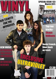
FRONT COVER
-A distinctive colour scheme is used throughout my front cover. I have used colours which associate with my genre.
- Sell lines are used which my target audience would understand. I tried to balance out the amount of images & text used on the cover as I dont want to draw the reader away, but persuade them to buy the magazine.
- The image shows direct address which can make the reader feel involved as they are directly looking at the camera. I have used different ethnicities in my image to attract a wide range of audience and to show the different types of Indie bands out there.
- The props used shows stereotypes of Indie music and the costume the artists are wearing also shows conventions of the music genre.
- The slogan 'Love music to Love life' has many connotations behind it. The front cover overall shows many typical conventions which are usually seen on most magazines.
CONTENTS PAGE
-The contents page uses a colour scheme of black, white and grey which all stick to the theme. The images on the contents page show both direct and non address.
- The typography is the same as the front cover, it has not changed.
- The contents have been laied out in columns on the page to make it look organised and easy to read.
- An editorial is present to give the audience an insight in the magazine issue.
DOUBLE PAGE SPREAD

- The double page spread shows many conventions. Firstly the use of a blue background indicates the 'fun side' of Indie music and that it isnt always associated with dark colours.
- The main image is a low angle shot which shows a different side to the band; their status and achievment. The other additional images on the side can be seen as natural images as they are not posing however just looking straight at the camera.
- The language used in the text is Formal & Infomal due to my target audience.
- There is also a floating quote, main title, rhetorical questions and other techniques present on the double page spread to allow the audience to feel involved.


